JAPANESE PRINTS
A MILLION QUESTIONS
TWO MILLION MYSTERIES
Ukiyo-e Prints浮世絵版画 |
| Port Townsend, Washington |
|
UTAGAWA TOYOKUNI III
さんだい(目).うたがわ.とよくに. 1786-1865 |
|
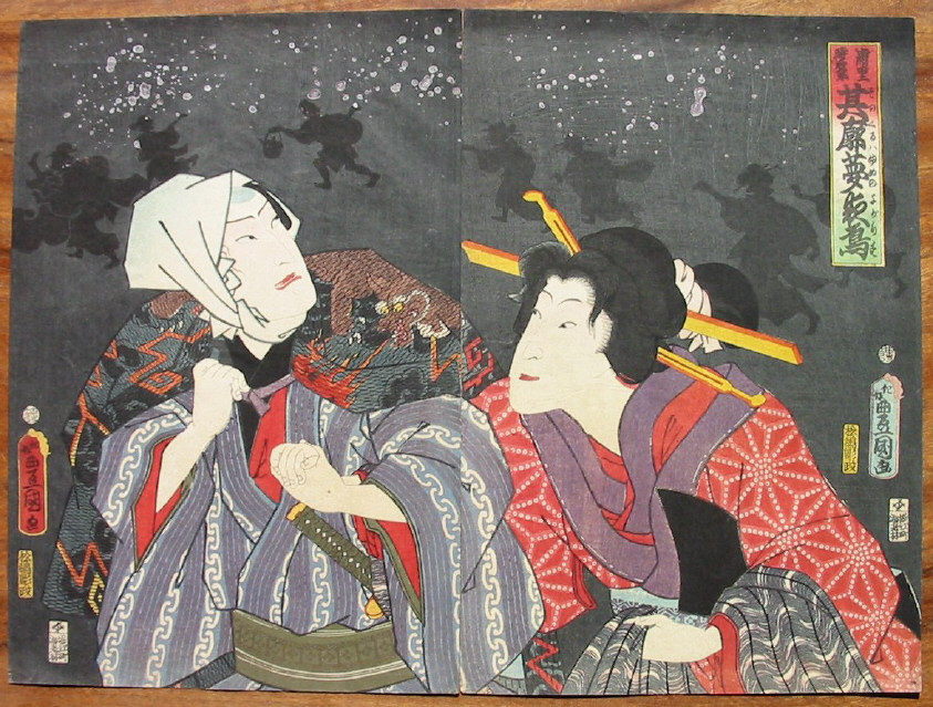
PLAY TITLE: 明烏雪浦里 |
|
ACTOR (LEFT PANEL): Nakamura Shikan 中村芝翫 なかむら.しかん ROLE: 時次郎 |
|
ACTOR (RIGHT PANEL): Sawamura Tanosuke 沢村田之助 さわむら.たのすけ ROLE: 浦里 |
|
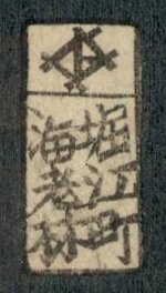
PUBLISHER: Ebi-ya Rinnosuke
版元: 海老屋林之助 |
|
DATE: 1860, 11th Month |
|
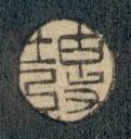
CARVER: Matsushima Hori Masu 松島彫政 まつしまほりまつ |
|
SIZE: EACH PANEL: 14 1/4" x 9 1/2" |
|
SIGNATURE: "To my own taste - Toyokuni ga" konomi ni makasete Toyokuni ga 好みに任? このみにまかすて? Note: As far as we know this signature only appears in 1860. |
|
|
|
$620.00 |
 |
||
|
There is another, rather tired looking copy of this diptych in the collection of the Ritsumeikan University. Their prints do not appear to show the silhouetted and fiery details of the background in ours. Perhaps that is simply a matter of how the images were prepared for transmission over the Internet. |
|
A RARE TECHNIQUE?
Generally, I try to never repeat the handling of a particular print because there are so many different designs to choose from. However, every so often one comes along --- or a pair as in this case --- which are just too good to pass up. When I first bought a copy of this diptych a number of years ago I was puzzled and amazed by the technique of controlled splattering which is obviously meant to represent burning embers falling through the sky. The application should mean that no two prints would ever be exactly the same.
Over the years it has become easier and easier to identify some of the elements such as publishers, carvers, etc. who worked on individual prints. In this case the publisher is Ebi-ya Rinnosuke and therein lies a key. Although I have yet to identify the specific performance being illustrated I do know that it was staged late in 1860. The costuming of the male figure tells us that he is playing a fireman. But it is that splattering technique which most mystified me and then I found a series of four similar prints by Yoshitsuya (芳艶 or よしつや), similar in look, similar in feel and representing exactly the same scene in the same way: Night, fiery embers, macho fireman and one woman, the same publisher and the same date. Clearly someone working for Ebi-ya Rinnosuke said to his boss "I know how to produce that effect. You know, the one with the fiery embers falling through the sky. Why not use a metallic ink?" Why else would two such similar sets of prints by two different artists, but for the same publisher create such a spectacular effect?
This is a technique which had long existed. It often was used to indicate snow, i.e., splattering with white. It is called gofun (胡粉 or ごふん), but I had never seen it used for embers or done with metallic inks. Perhaps there were some used on surimonos, but other than that I can't think of any examples. And...I am only guessing about surimonos.
But why would such a spectacular effect be rare? There are a number of possibilities: 1) While this style may appeal to me it might not have found a sympathetic market among its contemporary buying public; 2) It might have been too expensive. Perhaps these inks cost more than ordinary inks. Just speculating; 3) Controlling the medium might have been extremely difficult. Splatter mistakes would have proved extremely costly since the gofun had to be applied after the rest of the print was finished. Therefore this technique might not be worth the effort. Also the inks would have to be applied in such a way that they would not lump up or flake off later; or 4) It might have been an executive decision. Maybe the publisher was more interested in the bottom line than in quality. Just look at the publisher's seal and how crudely it was printed. Got to cut corners somewhere.
If anyone out there in cyberspace has any other ideas or knowledge of this technique I would love to hear from you. |
|
In the Museum of Fine Arts in Boston there is another diptych by Toyokuni III apparently showing the same two figures as those shown on this page, but in different poses. (The accession number is from the William Sturgis Bigelow Collection 11.29139.) Again it is a night scene splattered with the same metallic inks. The publisher is the same as the one here. However, I was unable to see the date seal clearly enough to tell if it is the same date, but I would bet it is. Hopefully one day I will get the opportunity to see an example of this other diptych in person so I can make a more thorough comparison. Other than that the similarities are uncanny without being exact. |
|
|
|
|
|
|
|
|
|
|
|
Carver's Seal: Matsushima Hori Masu |
|
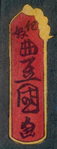
Publisher's Seal: Ebi-ya Rinnosuke |
|
|
|
|
|
|
|
Date Seal: 1860, 11th Month |
Artist's Signature: konomi ni makasete Toyokuni ga |
|
Direct purchase may be
made through check or money order or |
 HOME
HOME